
Website for DJ Terrace
As someone who has produced music since the 90s, DJ Terrace asked me to create a portfolio website to show a full catalogue of tracks for his fans to view and read.
Research and Conception
I decided on the colour scheme of primary and secondary colours for DJ Terrace's website because of the use of these in T Stamp trilogy album covers that I also designed. They contrast well with black and white, and the jungle music that DJ Terrace creates is known for its prominence in the rave scene, full of bold colours and fonts.


Inspiration images


Colour palette

DJ Terrace's logo (designed by Greg Blackman) makes good use of primary colours and is an illustration of a photograph taken of Terrace when he was a young boy. I wanted to use the theme of nostalgia conveyed in the logo throughout the website as he expressed that his roots are very important to him. The logo also features the Kniteforce logo - Terrace's record label - to demonstrate his exclusivity to them which is mentioned throughout the site.
Page Design

The home page uses the bold colours from the palette and features a description of DJ Terrace and his work as an introduction to the viewers. I included as many key words as I could for SEO purposes while being as true as possible to Terrace's image.


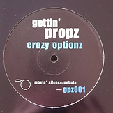
These two pages use the Impact font and a regular sans serif font, with much of the content in black and white. This reflects the aesthetics of the Kniteforce Revolution website (the label DJ Terrace is exclusive to) and many of his album covers (pictured below). Terrace wanted to let his music speak for itself and has always been more concerned with his sound rather than the album cover designs, so I wanted his site to be stylish but simple.


Inspiration designs
Software used during this project

